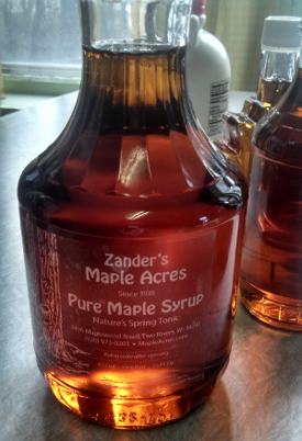
We have a new look! Replacing all our labels, business cards and recipe books with a consistent look across all of them. We had an eclectic mix of fonts, colors and images on the old labels with every piece different. We wanted to emphasis the maple syrup so went with clear labels. We bottle most of our syrup in glass so a clear label allows the beauty of the syrup to show through.

Its taken five years to bring this vision to life. The challenge was the image to use on the label. Many labels have a team of horses pulling a wagon through the sugar bush. Or have a syrup building or other images associated with old fashion syrup making. We never had horses so that image wouldn’t work. Didn’t want something too modern or abstract either. We realized we had a image from the 2012 season of trees with buckets after a snow storm. That became our inspiration.
We wanted to keep everything local. Worked with a local graphic designer on the layout and a local printer. Cousin Amy did the drawing of the tree and buckets based on the photo. She’s a talented professional artist working with ceramics and finger paintings. She helped coordinate all the pieces to bring this vision to life while I worked in the woods.
The label pays tribute to the heritage of the old label. ‘That label dates to the 1960s. We kept some of the fonts and kept the same phrasing and tag lines.
The view of the bottle constantly changes as the light hits the bottle from different directions and different intensities. The maple syrup is the art and now the clear label allows it to shine.
Leave a Reply
You must be logged in to post a comment.